Just another WordPress site
Posts tagged election results

Visualize Data with Politico
Nov 10th
Shellacking, Slaughter, Tsunami. No matter how news organizations characterized the midterm-election results, it was a golden opportunity for the media to use data visualization in their reporting. With the massive amount of data from so many national elections happening across all 50 states, political junkies needed a visual narrative and Politico delivered.
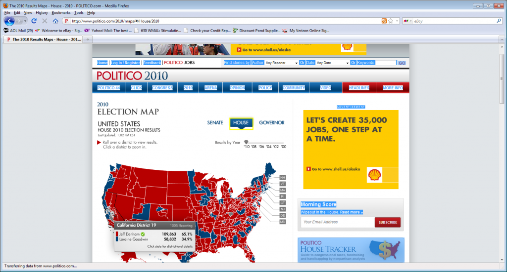
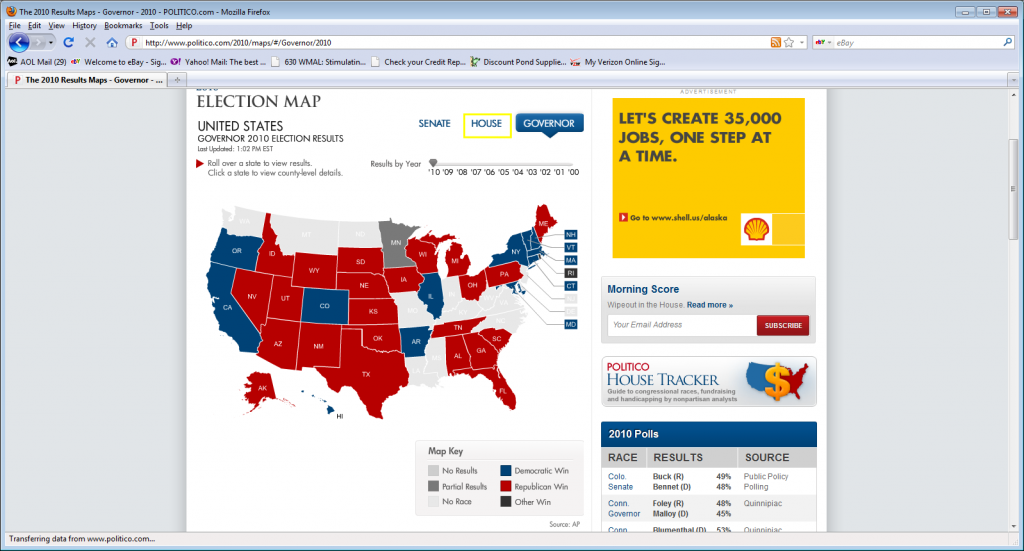
Politico used interactive maps (link to election maps) to consolidate the enormous wave of information being reported last Tuesday evening. Using blue and red to denote Democrats and Republicans, respectively, the color coded maps let readers instantly understand the winners and losers. No text was needed.
One interchangeable map was used efficiently. It changed with only a few clicks. Readers saw one map and could select one of three categories: Senate, House or Governor races. There was no going from place to place on Politico’s site. One click on the HOUSE category, then on a particular state, a pop up window with the names of the House candidates vying for office in a particular district (or in the case of Senators/Governors in that state). Also, within in that window was the number of votes each candidate received and by what percentage.


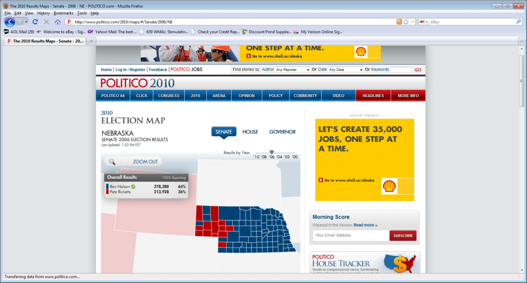
Then, Politico took the visual further by offering readers historic information. An arrow on the up right side of the map with different election years, allowed people to not only see the re sults from 2010, but move the arrow to another year and see previous election cycles in terms of red and blue states. Below is an example of Nebraska in the 2006 Senate race.
So after a comparison of 2010 Senate races, the viewer could then move the arrow back to look at 2008 or 2004 and see which states were blue and then which were red. The information covered a ten year period of election results. In his 10000words.net blog posted on November 2, Mark S. Luckie, highlighted Politico-ranking it number nine out of 11- as one of the news organization that used “. . . their political coverage is showcased in a way doesn’t feel crammed or overwhelming.” (Read Luckie\’s post from election night).
When dealing with numbers, eyes can glaze over, and listeners and viewers can tune out. But Politico used data visualization in a cohesive way to illustrate the big picture of the change in the political landscape, at least for the next two years. The maps were easy to read and in the age of eyes just scanning the page, Politico won the night.


