Just another WordPress site
Posts tagged flag

Salute the Red, White and Blue! Politico flies the flag in its web design.
Oct 6th
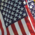
During election cycles, politicians fly the colors of the American flag, red, white and blue, to rally voters. Politico has co-opted these colors in its web design to cover all things political and keep readers on its site. The combination of the three colors as a background or font color, add harmony to maintain the flow throughout and brings unity to Politico’s entire web design, page after page, www.politico.com.
The endearing acronym, C.R.A.P., contrast, repetition, alignment and proximity, describes Politico’s design. The contrast of red and blue with a white background shows there is a sharp difference in color among the various sections. Red could represent the Grand Ole Party (GOP), or be taken as a power color. It is also the color used for the tab marked headlines across the menu bar at the top as if to alert the reader. Blue on the other had, is the color choice for Democrats. It could be viewed as a soothing and trustworthy color choice. Hence, reporters’ bylines are in blue. Also in contrast is font size of the word, Politico, it varies as your eye moves over the site.
Next is Politico’s repetition of those colors throughout the site. From page to page, the color theme of red, white and blue, is used consistently. There is repetition in the word Politico – it is always in red, always in the same font style, and always in capital letters. The font size of the text for stories is the same and in harmony. One recent break in tradition was the special banner to identify two new opinion columns which showed a different font and size.
Just like traditional newspapers, Politico’s site follows a grid system. Its alignment flows from section to section, from photos to stories. Each new square and line offers distinct and different news elements. Finally, proximity is used appropriately with related elements group together. Fox example, on the right side, blogs in one box and below that section, Politico Opinion in another box. The unity works and make it easy for readers.
There are few ads on the site but even ads are consistent with the color theme with the words such as ‘sponsored by’ in blue to maintain the harmony. What is jarring to me are the photos attached to the top story. The photos are five or six inches high and force readers to scroll down to read the content. The scale of the photos from my perspective take away from the harmony compared to the other photos on the site. Otherwise, Politico pays homage to America’s flag to the fullest.
